The Town of Pulga
California Gold Country's Magical Mountain Miracle
Case Study 4 : A Town as a Brand
This project called for creating an end-to-end mobile app for Pulga, California, a miracle of a town tucked deep into Northern California’s Feather River Canyon. Much more than a town, Pulga needed an stand-alone app that was both useful to visitors (the town has no cell service), and also serve as a conduit for a greater brand and lifestyle.
Background
Protected on all sides by canyon walls and fed by the river, Pulga naturally cultivates an ecosystem that is both visually beautiful and teeming with life. Pulga’s sustenance made it an ideal settlement for indigenous tribes for centuries. Then came American settlers during the Gold Rush. Soon a railroad was added and the town became a bustling stop that thrived Into the 1960’s.
“The vision of Pulga transcends simple weekend destination into that of an overall lifestyle brand.”
As the town’s mainstream traffic slowed, it became known as a retreat town, hippie exile, and Pagan commune. Janis, Hendrix and the Dead were all known to pass through. The property changed hands a few times, aged, and fell into disrepair. By 2014 Pulga had become the quintessential ghost town, was famously placed for sale on Craigslist, and in March of 2015 the 62-acre town was purchased for $499k.
The new owners have since put exhaustive work into restoring the place, and in the spring of 2017 formally reopened as a town that can be rented in its entirety. But it’s more than just an unplugging getaway. Pulga is tapping into an emerging culture of “glamping” experiences (glamorous camping), and becoming a year-round extension of the Burning Man / Coachella / #vanlife community.
Though only a few months into operation, the town has bookings extending over 2 years, some entering six-figure billings.
The vision of Pulga transcends simple weekend destination into that of an overall lifestyle brand defined by art and music, clean bodies filled with clean food produced from a clean Earth, an almost neurological path of self-discovery, and strong community values. While it may be a physical town fixed in one location, it’s “residents” live throughout the world, and are bound more by a shared philosophy than geography.
The Process
Discovery: Why is Pulga Different?
Look, I don't identify as any kind of "Hipster." Or as a "Burner." Or as one of those "Techie Kids" or "EDM Kids" or any kind of grown-up "kid." In fact, I kinda get the howling fantods at any kind of categorical stereotype.
That said...
I know those people. I live among those people. I am ensconced throughout the San Francisco Bay Area with those people. And I willingly adopt many of the aspects that inform such stereotypes (...while hopefully diluting what might otherwise have been a "redneck" or "frat boy" stereotype?).
I prefer well-built and lasting "throwback" products over disposable planned obsolescence. I like unprocessed real food (though the term "farm to table" now makes me gag). I'm completely behind The 10 Principles (though I think something is wrong with you if you have to be told to live them). I love music made by computers and art that is sometimes on fire and any excuse to dress in costume.
I am the Pulga persona.
My research for this project includes over a generation of watching a lifestyle emerge, composed of a distinct set of customs, mentalities, activities, icons and symbols, attire, artifacts and even unique language elements. Modern business practices, products and designs, and even the UX craft itself owes itself to many of the philosophies that have spawned from this culture: Is it useful? Does it have value? Is it delightful? Does it inspire joy?
While Pulga is indeed a spot on a map, it is also a role-player in this community. Much like Caesar's Palace is not simply a hotel, Pulga is a brand that represents a mindset and is a destination for like-minded groups. Recently such groups -- from Burning Man theme camps to forward-thinking corporate team-building outings -- have sought getaway locations conducive to inspirational experiences. A would-be competitor -- nearby Belden, CA -- has hosted similar town-takeover events for a few seasons. Pulga is the first effort to specifically create this environment from the ground up.
Defining: Reaching the Pulga Persona
In designing the app, I had two goals.
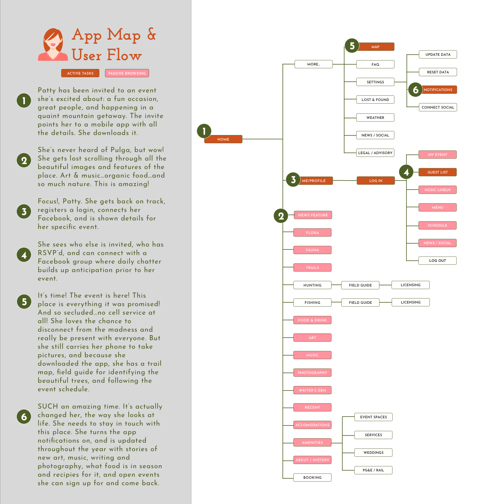
- Create something useful for guests without an internet connection, including trail maps, nature guides, art descriptions, venue details and schedules.
- Create a hub coalescing what was delightful about the culture, including music and art, organic food recipes, original literature, and unique stories...a year-round virtual destination extending beyond the momentary weekend destination.
I approached the project through the eyes of a variety of prospective users, all of whom share this common culture, but who have different motivations for passing through Pulga. Here below I've imagined four personas:
- The Big Life Event / Wedding Planner.
- The Corporate Retreat Leader.
- The Festival Promoter.
- The Enthusiast -- the hunter, angler, hiker, photographer, writer, etc.
While each may arrive at a Pulga stay for different reasons, they all choose such a destination over many other options due to a shared appreciation for the lifestyle brand Pulga is cultivating. My app needed to fulfill that culture in real time as each guest was on site, but then further establish an ongoing conduit to these values and to a community.
Designing : An iOS App for Now and Later
Designing for iOS, I envisioned a gallery of cards that intermingled the useful -- like the details of who in your party was staying where, with the delightful -- such as recipes using ingredients currently in season. Blending the two might be the summation of an art piece that a current guest may be standing in front of while a past guest is learning about from a distance or recalling how she saw the piece previously at a public plaza in San Jose. Together they create more than a place, but a state of mind, one that the user never really has to leave.
Delivery : User Testing
I ran an InVision prototype past several people. Though all were likely users, they were also all friends who know Pulga, so I realized some bias would be present. Most of the errors seemed related to the Invision presentation. Users needed to be trained on the limitations, swipe gestures and the use of blue zones. But overall the Pulga app was well received. Design, layout, photos & color were all positive. Any errors were in navigation -- where to find the map, and identifying "My Events" page after login -- which led to some V2 design tweaks, but overall is seemed many errors would solve themselves upon a live app being built, with live navigation, photos and headers.
Conclusion
One question heading into this project was about the need for it at all. Users rarely bother with "temporary" apps that are only relevant for brief moments. But when those moments become something bigger -- say three days at Coachella or a Vegas weekend -- users will embrace the app and continue to interact with it as a means of elongating the experience after the event is over. Some events -- like Burning Man, the Tour de France, the World Series of Poker or a UFC Fight -- evolve well past the event occurrence and into an ongoing lifestyle and culture. That's the essence of Pulga, California, and what is achieved in their iOS app.


